.jpg)

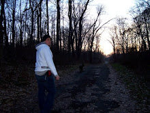
I added extra color to one of them and toned the other one down to look at the difference between the two and decide which one was more effective. The brighter one seemed a bit overwhelming, and the black lines divided the image too much. I made them brown and toned down the saturation a bit. This seems a bit better since there will be another layer applied on top of the Image, making it a bit darker anyways. I'm not too worried about the other two images in this series since I will be drawing from this image and using the same colors as to keep a unity in the single body of work across three images.
1 comment:
James,
What about using various saturation levels throughout one image to guide use through the image and to reflect the high points and low points in music.
This would also add some depth to the piece because right now almost everything is operating on the same level of the picture plane.
( sorry about my lack of musical terminology but I think you'll understand what I'm getting at)
Does the the series or the individual image have a title? What are you trying to get us to see in this work?
I see pattern and rythm but I think you still need to push the type of rythm or music reference in the work.
Post a Comment